How to Blend Colors in Canvas Painting: Techniques for Smooth Transitions and Rich Depth
Blending colors in canvas painting is essential for creating depth and visual interest in artwork. Understanding the basics of color theory and the techniques involved can transform a simple painting into a captivating piece. Many artists struggle with achieving smooth transitions and harmonious blends, making it vital to master this skill.
Using tools such as brushes, sponges, or even fingers can help in experimenting with different blending techniques. Picking the right colors and knowing when to mix them on the canvas rather than the palette plays a crucial role. Gaining confidence in these methods allows for greater creativity and personal expression in every painting project.
With practice, artists can develop their own unique blending styles and discover what works best for them. This blog post will explore various methods, tips, and tricks to effectively blend colors on canvas, ensuring an engaging experience for both beginners and seasoned painters alike.
Understanding Color Theory
Color theory provides a framework for artists to understand how colors interact and can be blended in canvas painting. Knowledge of primary colors, color relationships, and the categorization of colors into warm and cool tones is essential for effective color blending.
Primary Colors in Painting
Primary colors are the foundation of color mixing. In painting, the primary colors are red, blue, and yellow. These colors cannot be created by mixing other colors together.
By mixing primary colors, secondary colors emerge:
- Red + Blue = Purple
- Blue + Yellow = Green
- Red + Yellow = Orange
Tertiary colors are formed by mixing a primary color with a secondary color, such as combining red and orange to create red-orange. Understanding primary colors is vital for artists, as they can create a vast spectrum of shades and tones by controlling ratios in their mixtures.
Color Wheel and Color Relationships
The color wheel visually represents colors and their relationships. It is divided into sections that display primary, secondary, and tertiary colors.
There are several important relationships to recognize:
- Complementary colors: Colors located opposite each other on the wheel, such as red and green. When placed together, they enhance each other’s vibrancy.
- Analogous colors: Colors next to each other on the wheel, like blue, blue-green, and green. These colors create harmonious blends.
- Split-complementary: This involves one base color and the two colors adjacent to its complementary color, providing dynamic contrast in artwork.
Using the color wheel effectively helps in selecting color schemes for blending purposes.
Warm and Cool Colors
Colors are categorized as warm or cool based on their emotional and visual impact.
Warm colors, like reds, oranges, and yellows, evoke feelings of energy and warmth. They tend to advance towards the viewer, making them useful for drawing attention.
Cool colors, such as blues, greens, and purples, convey calmness and serenity. They recede in a composition, offering depth and tranquility.
Understanding these categories aids artists in creating atmosphere in their paintings. Blending warm and cool colors strategically can also generate depth and dimension, enhancing the overall visual experience.
Preparing Your Materials
Before starting a canvas painting, gathering the right materials is essential for successful color blending. Selecting a suitable canvas, appropriate paints, and the right tools can significantly enhance the blending process.
Choosing the Right Canvas
The choice of canvas impacts the blending technique. Artists commonly use cotton or linen canvases. Cotton is more economical and works well for beginners, while linen offers superior durability and texture, which is preferable for advanced techniques.
Canvas comes in various textures: smooth, medium, and rough. A smooth canvas allows for finer blending, while a textured surface can create interesting effects.
Pre-stretched canvases save time, yet purchasing canvas rolls allows for custom sizes. A primed surface is vital, as it prevents paint absorption and facilitates better blending.
Selecting Paints for Blending
Acrylics and oils are two popular paint mediums. Acrylics dry fast, which can challenge blending but allows for quick layering. They also mix well with mediums like retarders, extending drying time.
Oils, conversely, dry slowly, making them ideal for extensive blending. They offer a smooth finish and richer colors.
Color choice significantly affects blending. Using a limited palette can simplify choices and help the artist maintain harmony in the work. Primary colors can be mixed to create secondary hues, facilitating more control during blending.
Tools for Blending
The right tools are essential for effective blending. Brushes are the most common tools, with various shapes and bristle types affecting the blending technique. Flat and round brushes both serve different purposes in blending.
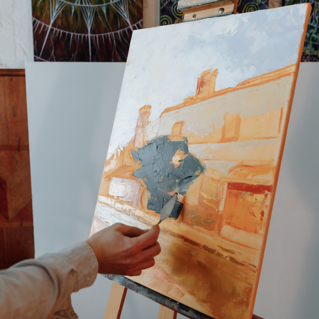
Palette knives can also be used to mix colors on the palette or directly on the canvas. They create unique textures and help achieve smoother transitions.
Other useful tools include sponges and blending stumps. Sponges can create soft textures, while blending stumps are great for fine details. Selecting the right tool depends on the desired effect and the medium used.
Blending Techniques
Blending colors effectively on canvas involves several techniques that can produce diverse visual effects. Each method has unique applications and can significantly change the appearance of a painting.
Wet on Wet Blending
Wet-on-wet blending occurs when fresh paint is applied on top of wet paint. This method allows colors to mix freely, creating soft transitions and gradients. It’s particularly useful for achieving a natural look in skies, portraits, and landscapes.
To use this technique, a painter needs to work quickly. The underlying layer should remain wet throughout the process.
- Tools: Use a palette knife, soft brushes, or a finger to manipulate the colors.
- Application: Start with a base color. Gradually add new colors, using gentle strokes.
This approach yields rich, vibrant results. Care should be taken to avoid mudding colors. Practicing this technique can enhance the painter’s ability to create depth and luminosity.
Layering
Layering involves applying successive coats of paint. Each layer can be allowed to dry before adding more color. This method builds texture and complexity in a painting.
To achieve effective layering, the artist should consider the following:
- Color Choice: Selecting transparent or semi-transparent paints allows the underlying layers to show through.
- Thickness: Thin layers generally work better as they dry faster and allow for better control over the final outcome.
- Process: Begin with a base layer of color. Once it dries, a new layer can be added to refine shapes or enhance details.
- Blending: Between layers, light sanding or glazing can improve depth.
This method ensures a controlled approach to color blending while maintaining vibrancy.
Glazing
Glazing is a technique where a thin, transparent layer of paint is applied over a dried layer. It modifies the underlying color and creates a sense of depth and richness.
For glazing, the right materials and techniques are essential:
- Paint Consistency: Use a medium to thin the paint. This ensures a smooth application without altering the texture of the base layer.
- Drying Time: Ensure that the base layer is fully dry before applying the glaze.
- Application: A soft brush is recommended for even coverage.
- Layer Control: Multiple glazes can be built up to achieve the desired intensity.
This technique can enhance the luminosity of colors, making them appear more dynamic and interactive.
Tips for Successful Color Blending
Effective color blending in canvas painting requires attention to detail and technique. Focusing on the right consistency of paint, understanding light and shadow, and maintaining clean brushes are essential components for achieving smooth transitions between colors.
Maintaining the Right Consistency
Achieving the correct paint consistency is crucial for smooth blending. Paint that is too thick can create harsh lines, while paint that is too thin may not adhere properly.
Artists should aim for a creamy texture. This allows the colors to mix well on the canvas.
Tips:
- Use a palette knife to mix colors thoroughly.
- Test the consistency by applying a small amount on a separate surface before painting.
- Add a medium, such as water or oil, to adjust thickness as needed.
Understanding Light and Shadow
Light and shadow significantly influence color perception. Artists must consider how light interacts with colors to create depth.
Key points:
- Observe the direction of light in the scene. This defines how colors will blend.
- Use lighter shades to highlight areas where light hits directly.
- Darker shades can indicate shadowed areas, creating a natural gradient.
Artists can experiment with color theory, using complementary colors to enhance shadows. This adds richness to the palette.
Cleaning and Caring for Your Brushes
Proper brush care ensures longevity and effectiveness in blending. Dirty or worn brushes can impede smooth application and color transitions.
Instructions:
- Rinse brushes immediately after use. This prevents paint from drying and damaging bristles.
- Use mild soap and lukewarm water for thorough cleaning.
- Reshape bristles after washing and allow them to dry flat. This maintains their form and functionality.
A well-cared brush will provide better control and precision, essential for successful blending techniques.